Website Design Principles That Turn Visitors into Customers

Most websites do not struggle with conversion because they look ugly. They struggle because they force visitors to think too hard about what the company offers, where to look next, and how to take the first step.
A conversion focused website is not about packing pages with aggressive pop-ups or countdown timers. It is about removing friction, clarifying your value proposition, and making the next logical action obvious. When layout, visual hierarchy, and messaging work together, visitors move naturally from curiosity to action.
At Tech Creeds, we approach every build through the lens of user intent. Whether you are redesigning an existing site or building from scratch, these practical design principles will help turn your traffic into paying customers.
Establish a Clear Visual Hierarchy
Visual hierarchy is the order in which a user notices and processes information on a page. When everything on a page demands equal attention, nothing gets noticed.
A high-converting page relies on three fundamental hierarchy rules:
- Size indicates priority: Your primary headline must clearly stand out from subheadings, body text, and navigational links.
- Contrast directs the eye: High contrast elements, such as a bold button against a muted background, naturally draw user attention first.
- **White space provides breathing room:* Packing every pixel with text, badges, and icons creates cognitive overload. Leaving generous space around key offers gives visitors room to digest the information.
There is an ongoing debate among marketing teams between creative, asymmetric layouts and familiar, conventional structures. Novel layouts can make a memorable brand impression, but they carry a real conversion trade-off: visitors must spend mental energy learning how to navigate your page. For core lead-generation pages and checkout flows, conventional patterns almost always win because they match user expectations.
If you are planning a redesign, our UI and UX design services focus on balancing distinctive visual branding with proven conversion patterns.
Craft Meaningful, Low-Commitment Calls to Action
Every commercial page should have one primary objective. When you present visitors with four competing options on a single screen, such as booking a call, downloading a whitepaper, watching a video, and reading a case study, you trigger decision paralysis.
The Trade-off: Single CTA vs Tiered Options
Directing every visitor toward a high-commitment action, such as "Buy Now" or "Book a 45-Minute Consultation", works well for users who already know they need your service. However, it alienates prospects who are still evaluating alternatives.
A balanced approach uses a primary and secondary call to action:
- Primary CTA: The main commercial goal (for example, "Request a Quote" or "Start Free Trial"). This button should use your highest-contrast colour.
- Secondary CTA: A low-friction alternative for prospects higher in the funnel (such as "View Our Work" or "Calculate Your Pricing"). This is typically styled as an outline or text link.
Keep button microcopy specific. Generic labels like "Submit" or "Click Here" create uncertainty. Instead, describe the exact outcome: "Get Your Proposal", "Download the Guide", or "Check Availability".
Eliminate Friction at the Point of Conversion
Friction is anything that slows a user down, creates hesitation, or introduces unnecessary effort. The most common source of friction on service and B2B websites is the enquiry form.
Consider a real scenario: a commercial fit-out firm was receiving around 2,500 monthly visits to their primary enquiry page, but converting only 1.2% into leads (30 enquiries per month). Their contact form asked for nine separate fields: full name, job title, company name, company size, work email, phone number, project budget, estimated start date, and a detailed project description.
By auditing user drop-off points, the team reduced the initial enquiry form to four essential fields:
- Full name
- Work email
- Phone number
- Approximate project size (a simple dropdown selection)
Detailed questions about start dates and specific project requirements were moved to a post-submission thank-you step or handled during the discovery call. Within two months, the conversion rate rose from 1.2% to 2.8%, lifting monthly leads from 30 to 70 without increasing ad spend or search traffic.
Every additional form field you require lowers your completion rate. Ask only for what your sales team strictly needs to qualify the lead and initiate the conversation.
Provide Contextual Proof Where Doubts Arise
Social proof works best when placed precisely where the user experiences doubt, rather than buried on an isolated testimonials page.
- Near the primary CTA: Place a one-sentence client quote, client logos, or an industry rating directly under your hero button or contact form.
- Beside pricing tables: Add a concise case study snippet showing how a similar business achieved a measurable return on investment.
- On product pages: Highlight warranty details, security badges, or customer review summaries alongside product specifications.
You can explore our portfolio of client projects to see how we integrate contextual proof into commercial websites without cluttering the page flow.
Design for Speed and Structured Workflows
Visual polish means very little if your pages load slowly or break on mobile devices. Over half of web traffic originates on mobile, yet many desktop designs treat responsive behaviour as an afterthought.
A fast, reliable website starts in the planning phase. When design components, button states, and spacing rules are systematically structured before development, the resulting code is cleaner and faster. We have written previously about using Figma design systems to keep technical debt low and maintain visual consistency across large sites.
When choosing between a template-based site and a bespoke build, consider your maintenance capacity. Templates offer quick deployment, but custom designs allow you to strip out bloated scripts, tailor user journeys to your exact audience, and maintain optimal page speeds.
Frequently asked questions
How many calls to action should a landing page have?
A landing page should have one clear primary goal, repeated at natural intervals down the page. You can offer a subtle secondary option for visitors who are not ready to commit, but you should avoid presenting multiple competing offers.
Does a minimalist design always convert better than a detailed page?
Not necessarily. Simple, minimalist layouts work well for familiar, low-risk purchases, but complex B2B services and high-ticket products require enough detail to answer common objections and build credibility before asking for an enquiry.
What is the biggest design mistake that hurts conversion rates?
The most frequent mistake is hiding the core value proposition. If a first-time visitor cannot determine what your business does and who it is for within five seconds of landing on your site, they are likely to leave.
How often should we test and update our website layout?
Major redesigns are best carried out every two to three years, but individual elements such as form fields, headline copy, and CTA placements should be reviewed and refined quarterly based on analytics and user session data.
If you are planning to rebuild your website or want an honest assessment of why your current layout is not converting, book a free discovery call. You will speak directly with one of our founders, Maisam or Jawwad, to discuss practical ways to turn your site traffic into measurable business growth.
More from the blog
 Web Design
Web Design vs Web Development: Which One Do You Need to Hire?
Web design shapes how your site looks and feels, while web development builds how it works. Here is how to…
 Web Design
Webflow CMS Collections vs WordPress Custom Fields for UK Agencies
Compare Webflow CMS Collections and WordPress custom fields for UK marketing sites. Learn which scales better for speed, design control,…
 Web Design
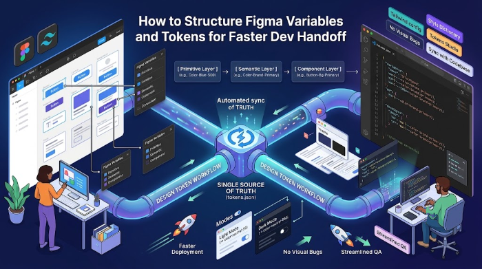
How to Structure Figma Variables and Tokens for Faster Dev Handoff
Learn how to set up Figma variables and design tokens so your design and development teams stay aligned and ship…